

Lead generation: how to optimise your product pages from a user's perspective
6 min read
The success of marketing activities is often decided on the product web page: do searchers find what they need here? Do they understand what benefits are on offer? Is the path to ordering simple and intuitive? Do users perceive the brand positively?
A good product page has to answer many questions and fulfil many tasks. We've put together the six most important points for user-centred optimisation of product pages. The most important thing here is to develop empathy for users/customers and understand what needs they have.
What is a lead?
A lead describes the initiation of contact, or the provision of contact information, by a prospective customer. Leads can be email addresses, phone numbers, names, company details, job titles, etc. Companies can generate or capture leads on websites in various ways: through classic registration, by calling a contact person, or by signing up for a newsletter. Every company can define for itself what counts as a lead. So a lead can take different forms, e.g. a contact enquiry, newsletter registration, dealer search, or fully completing the contact form.
We've put together six especially important measures for better lead generation on product websites for you here:
1. Take search engine optimisation seriously
User perspective: I can only buy what I find.
More than 90% of all online experiences start with a search. Only companies that users can find online can stay competitive in the long run. That's why we've seen growing investment in search engine optimisation for some years now. The days of stuffing text with keywords are over, though. SEO has become a complex, interconnected part of online communication: in particular, SEO and UX now need to be thought through together.
2. Product names should be intuitive and descriptive
User perspective: what actually is that?
Many of our customers work with complex products and very large product ranges. The respective names and areas have often become second nature to employees. New customers, however, first need to be taught complicated names. That's costly and expensive. Companies that describe their products in clear language and give them understandable names automatically practise search engine optimisation.
In our UX tests, we often find that participants are confused by product names.
Why do they give the product such a strange name?
Clear, understandable names and product descriptions that explain to users what the product/service is about are user-friendly and lead to significantly more and better leads.
3. Highlight product benefits and offer product comparisons
User perspective: why is the product right for me?
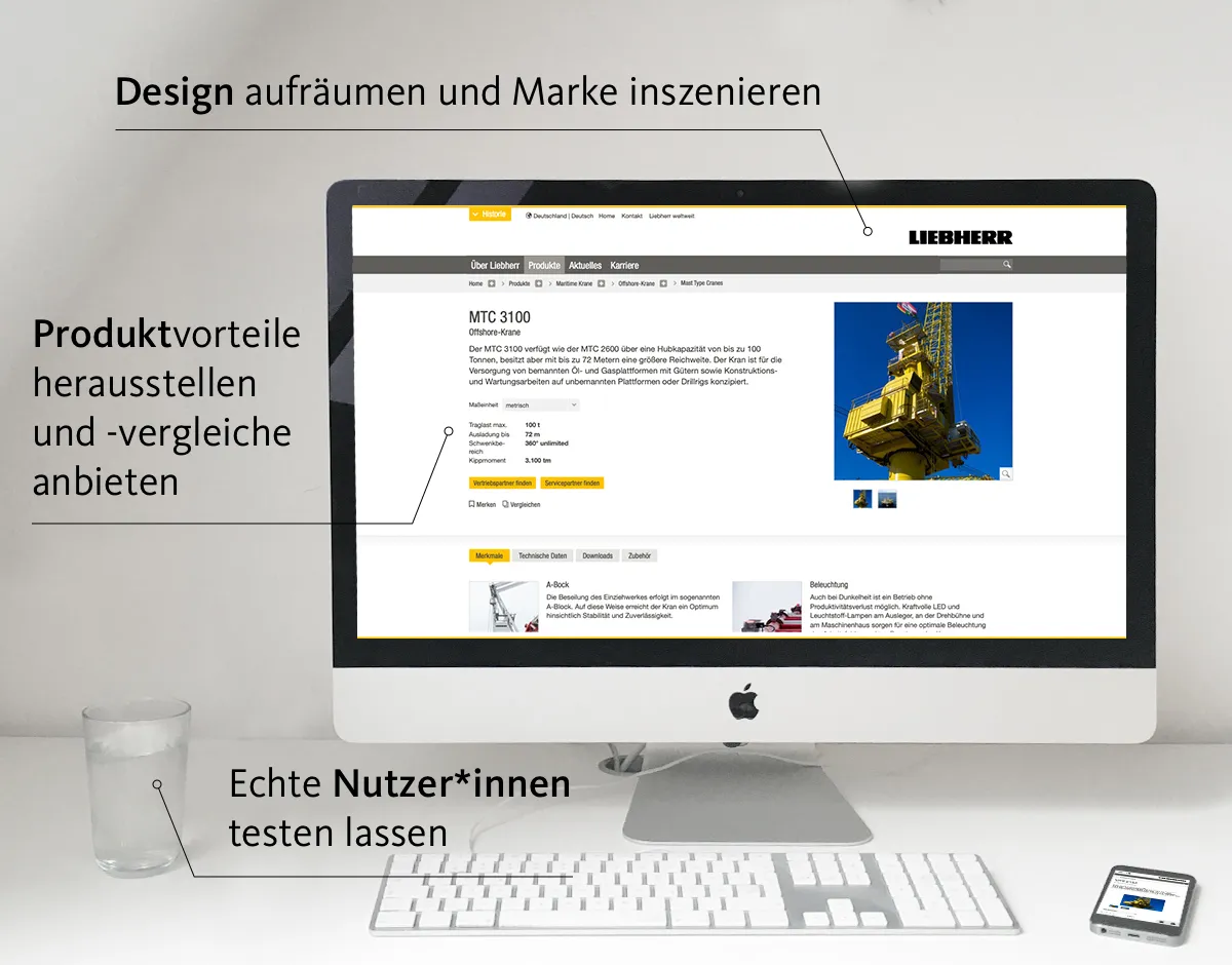
"What's the difference here now? How can I compare that?" When participants in our usability lab react like that, something has gone wrong on the website. Good products always have distinct features and clear benefits. The product page should communicate these clearly and understandably. What can the product do? What do I use it for? Why is it the best choice for me?
We answer these questions for our clients, for example, through feature lists with filter functions. The next step is developing comparison tools – product comparisons that analyse several products and highlight the differences. This ensures that users immediately have the confident feeling of having found exactly the right product.
4. Tidy up design and showcase the brand
User perspective: how does visiting the site feel?
Convey information, evoke emotions, guide users, direct attention, stay memorable etc. The function of design goes far beyond pure aesthetics. For companies, it's important to have a design concept that gives their customers confidence and orientation. A clean product page can increase acceptance and trust. Whereas overloaded, cluttered pages can create the feeling that the company is uncontrolled and untidy. Product pages are accessible worldwide and often the decisive step towards lead generation or conversion, yet we notice that their appearance isn't always top of the priority list for marketing directors. That has to change.
5. Shorten and optimise forms and application processes
User perspective: what do I have to fill in?
A potential customer saw our advertising poster. She searched for the product. She clicked the right search result. She landed on our landing page. Here she finds all the key information. She clicks "order now" and... Sees a form with 18 fields she has to fill in. Here, she drops off.
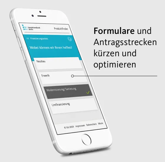
This little story happens every day! Our experience shows that in many companies, forms and application journeys are developed by specialist departments. However, every form shown to users should be analysed and optimised with the help of UX experts.
Only ask for the minimum! And ask for it in the right portions. A good form only asks for data relevant to the rest of the process. Through measures such as preview text in form fields, meaningful call-to-actions or natural language, online forms can become not only more appealing and user-friendly, they also directly contribute to the company's success and the positive perception of the brand.
6. Have real users test it
User perspective: does it work the way I expect?
In our usability lab, we use test participants to test our customers' websites and applications. In these test sessions, we regularly see participants overlook important elements, get irritated by small details or misunderstand messages. A well-structured, logical and strategically optimised website can still fail the moment real users get their hands on it. People get distracted, face countless possible usage contexts and access websites on all kinds of devices. Optimising a website perfectly for every one of these cases is close to impossible. In our UX lab, however, it is possible to check whether a website leads to the desired outcome for different users in different contexts.
Through in-depth interviews with our test subjects we also learn things the monthly KPI report doesn't reveal: how does visiting the site feel? What do the colours trigger? Is the core message understood and remembered? How do users experience your brand in direct interaction? And why do subjects abandon or continue?
Only those who carry out user tests can claim to take user experience seriously.
Optimise B2B product pages
In B2B companies we see specific processes and customer relationships. B2B players often work closely together for many years. But here too, new fields of action are opening up as part of digitalisation:
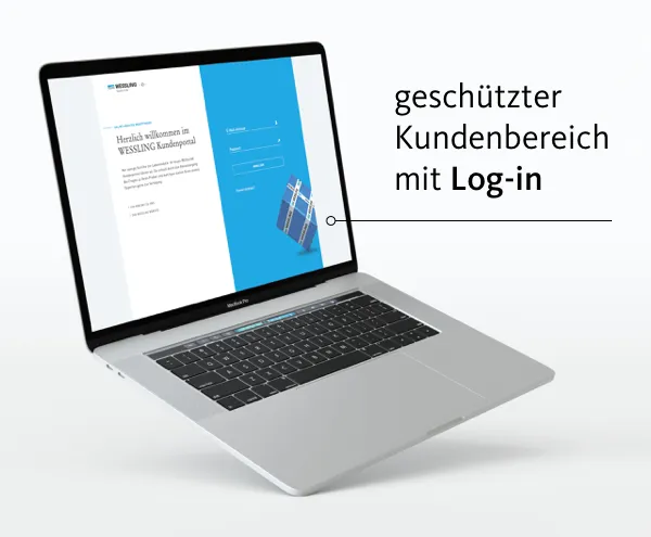
A protected customer area with login and remember function has become standard among our B2B customers. Technically too, B2B often has different requirements and needs: particularly high data security, internationalisation and the integration of PIM and CRM systems.
However, the tips above are also relevant for all B2B websites that want to generate or convert leads.
What can we do for you?
Would you like to realise a digital project? Then get in touch with us. As a reliable partner, we offer interactive brand experiences and complete digital solutions from a single source.
Optimising finance product pages
In the banking and insurance sector, our user study highlighted three key characteristics:
Advisory options: loans and insurance products that need explaining usually require additional advice. What options does your website offer?
Product staging: financial products aren't physical. There's no imagery for them. Presenting them in an emotionally engaging and understandable way is a challenge.
Conclusion: application journeys for financial products often hold great optimisation potential. What information do you really need, and how can conversion rate be improved?
Conclusion: the most important expert group you need to ask about your product web pages is your customers.
There are several elements of a product website that absolutely should be considered if you want to generate leads sustainably: search engine optimisation, self-explanatory product names, benefit communication, clean design and short, good forms. But the most important thing when optimising a product website is to ask potential users questions and thereby understand them.
Your contact person
- Marcus Völkel
Consultingsynaigy
Show phone numberShow email address